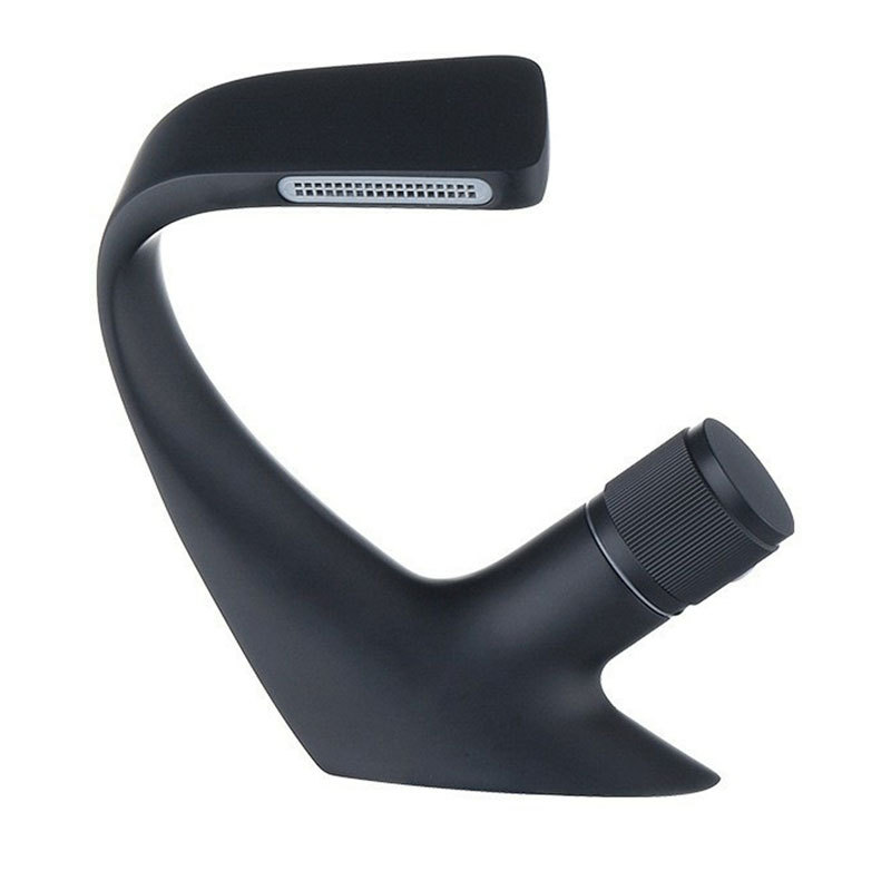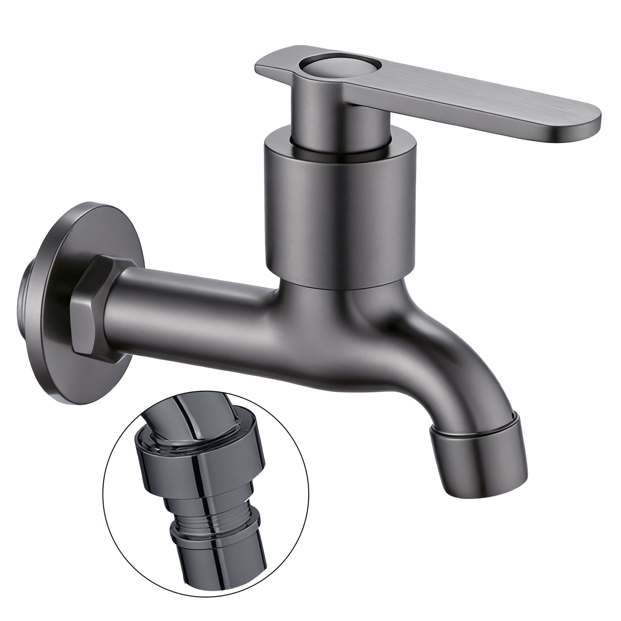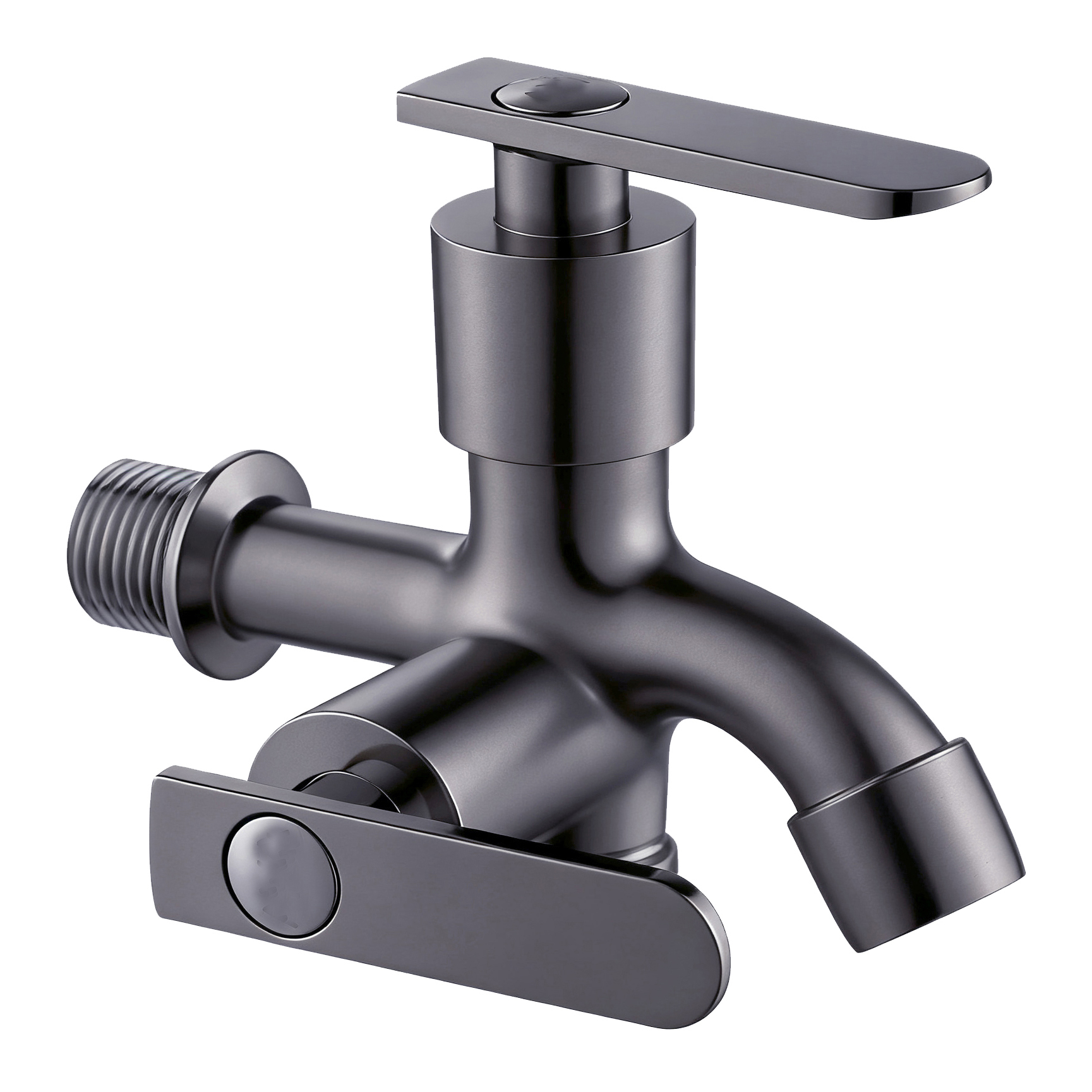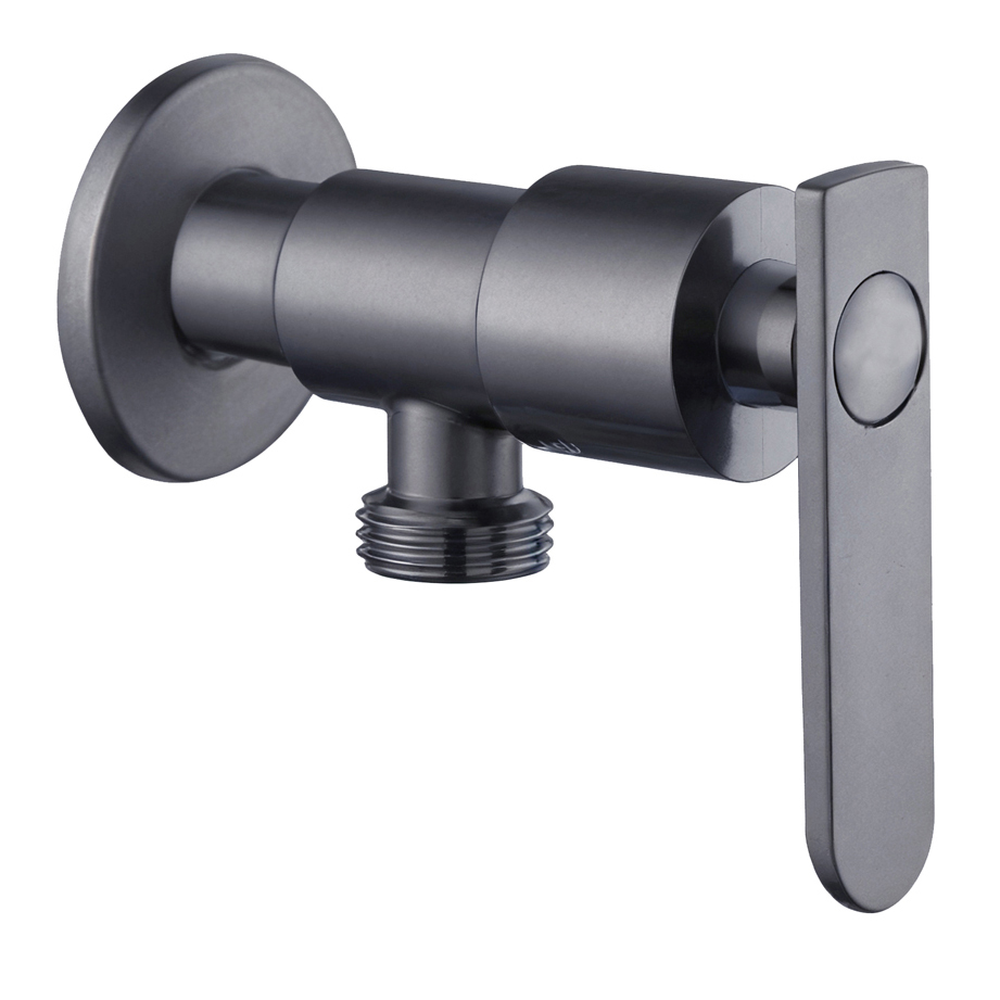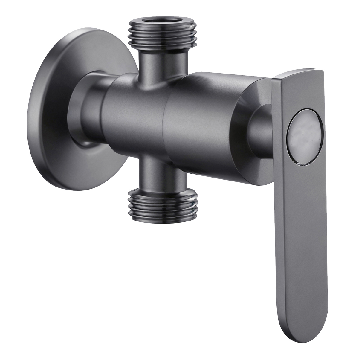




Chrome, Polished Nickel, and Brushed Nickel can look clearly different when they appear in three separate product images.
Put them together on the same retail shelf, and the comparison may become much less obvious.
From a normal shopping distance, customers may first see three silver-tone faucets.
If the finish names do not connect to visible differences, a Polished Nickel Shower Faucet can quickly become part of a simple price comparison.
The problem is not that shoppers “do not understand finishes.”
The real question is whether the retail display gives them enough information to compare the finishes properly.
Similar Finishes Do Not Need More Adjectives
Polished, Bright, Soft, Warm, Elegant.
Adding more descriptive words does not necessarily help shoppers understand the difference between similar silver-tone finishes.
What they can actually observe is reflection, surface texture, gloss, and overall tone.
Retail information for Polished Nickel should first help shoppers compare it with Chrome.
It should not turn a finish name into a claim about material or durability.
Stores can place physical finish samples under the same lighting and at the same viewing angle.
They can then explain reflection, cleaning requirements, and matching product options separately.
Procurement teams also need to check how suppliers manage the same finish name.
One supplier may use “Polished Nickel” across products from different plating factories.
Those factories may not use exactly the same approved color reference.
If this happens, buyers should manage the finish through sample numbers and approval dates.
This gives stores a repeatable finish standard for future replenishment.
They no longer need to reinterpret the same English finish name with every batch.
A brushed surface, for example, usually shows visible directional texture.
A polished surface creates a different type of visual effect.
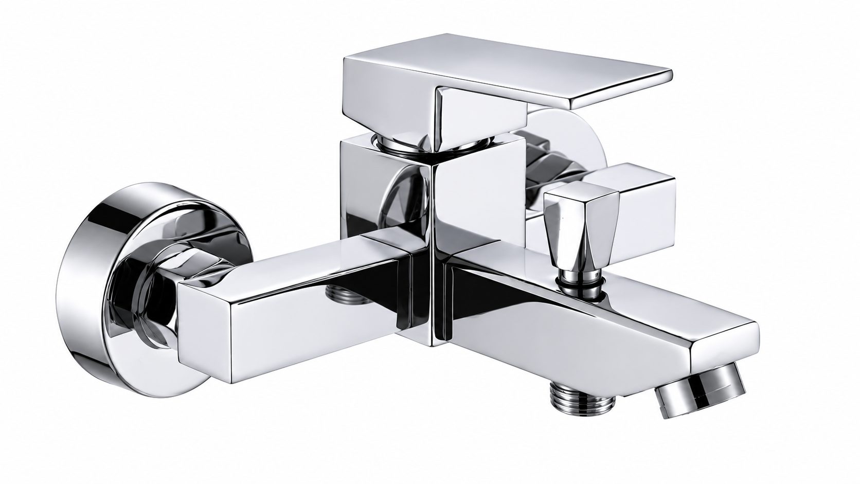
However, buyers should still judge the actual appearance of a polished nickel shower faucet from the real product or an approved finish sample.
The same finish name does not guarantee that every supplier will produce exactly the same result.
This is why side-by-side comparison works well for similar finishes.
Under the same lighting, background, and viewing distance, shoppers can see the real surface differences.
They do not have to imagine those differences from three silver-colored blocks printed on packaging.
Shelf Labels Should Explain How the Finishes Differ
If three SKU labels only say:
Chroom
Polished Nickel
Geborsteld Nikkel
the shopper receives three names.
Stores can display both Nickel finishes under the same light without claiming that one is “more durable” than the other.
If the finishes require different cleaning methods, that information should come from the product’s surface specifications and manufacturing guidance.
When real products already sit side by side, shelf labels should focus on details that shoppers cannot understand immediately from appearance.
They do not need to repeat the finish name again.
This changes the way shoppers compare a Polished Nickel Shower Faucet.
Instead of asking only:
“Why does this silver faucet cost more than the one beside it?”
they can first decide whether they actually prefer its surface appearance.
They can also see whether the difference from the other finishes matters to them.
Retail presentation for similar finishes should not make the differences sound larger than they really are.
It should make the differences that genuinely exist easier to see and understand.